
ASU CFO Site · Arizona State University · Business and Finance
Redesigning ASU’s Business and Finance site, so payroll, travel and policy answers are found, not hunted for
- UX designer & researcher
- Information architecture
- 12 user interviews
- WCAG 2.2
Overview
Simplifying access to financial information for the whole ASU community
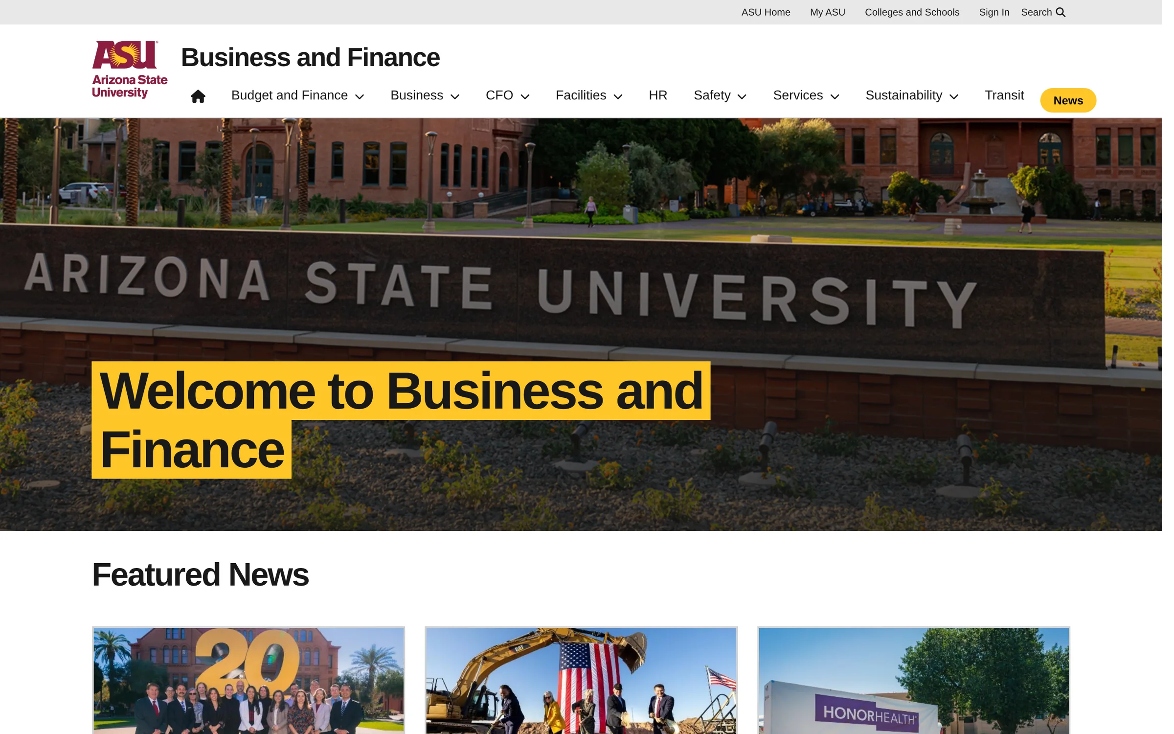
The Office of the CFO runs the site where ASU students, faculty and staff go for payroll, travel, purchasing, safety training and financial policy. It had grown page by page for years, and it showed.
Business objective
Improve access to financial resources on the CFO site to reduce support load, boost user satisfaction and support ASU’s operational efficiency.
- Client
- Arizona State University · Business and Finance
- My role
- UX Designer & Researcher
- Timeline
- Jul 2024 – May 2025 · 11 months
- Team
- 1 UX specialist, 2 content writers, 1 project manager
- Tools
- FigmaFigJam
● The redesign is live on the ASU Business and Finance site
Visit cfo.asu.edu ↗01 · Problem space
Most visitors left without the answer they came for
Students, faculty and staff often struggled to find essential financial information on ASU’s CFO site because of confusing navigation and dense content, leading to frustration and more support requests. The experience needed to be simpler and more intuitive to serve the ASU community.
- 70%struggled with finding information
- 30%frustrated by unclear or outdated content
Challenges
The site had a lot of complicated content that made sense to finance teams but confused everyday users. It was hard to organise everything in a way that worked for students, staff and faculty without losing important details, and the design had to follow ASU’s brand and accessibility rules, which added a layer to every decision.
 Too Much Complexity
Payroll, travel, procurement, safety and policy on one site, each with its own depth.
 One Site, Many Needs
Students, staff and faculty arrive at the same front door with very different questions.
 Content Overload
Long pages and repeated links buried the answer people came for.
 Rules & Restrictions
ASU brand standards and accessibility rules shaped every decision.
The question I designed for
How might a student, a professor and an administrator each get to their answer in a few clicks, and trust it once they’re there?
02 · Research
Understanding user needs and pain points
I talked with 12 students, faculty and staff and watched them look for things they really needed: a pay schedule, a travel reimbursement, a safety course.
 6 out of 12
struggled to find basic financial or HR-related information due to a confusing site structure.
 65% of users
said the site felt “overwhelming”, with dense text and unclear labelling.
 1 in 3 users
resorted to contacting support because they couldn’t locate what they needed.
 2.1 minutes average
to find commonly searched pages like Payroll or Travel Reimbursement.
 Every 3rd user
described the site as “cluttered” or “outdated”, which lowered trust in the content.
Crucial insights from research
- 110 out of 12 users
wanted quicker access to resources like pay schedules and reimbursements.
- 28 out of 12 users
clicked through multiple irrelevant pages before reaching the right one.
- 33 out of 12 users
found site search unhelpful and relied on Google instead.
- 47 out of 12 users
weren’t confident the content was current or accurate, citing date confusion.
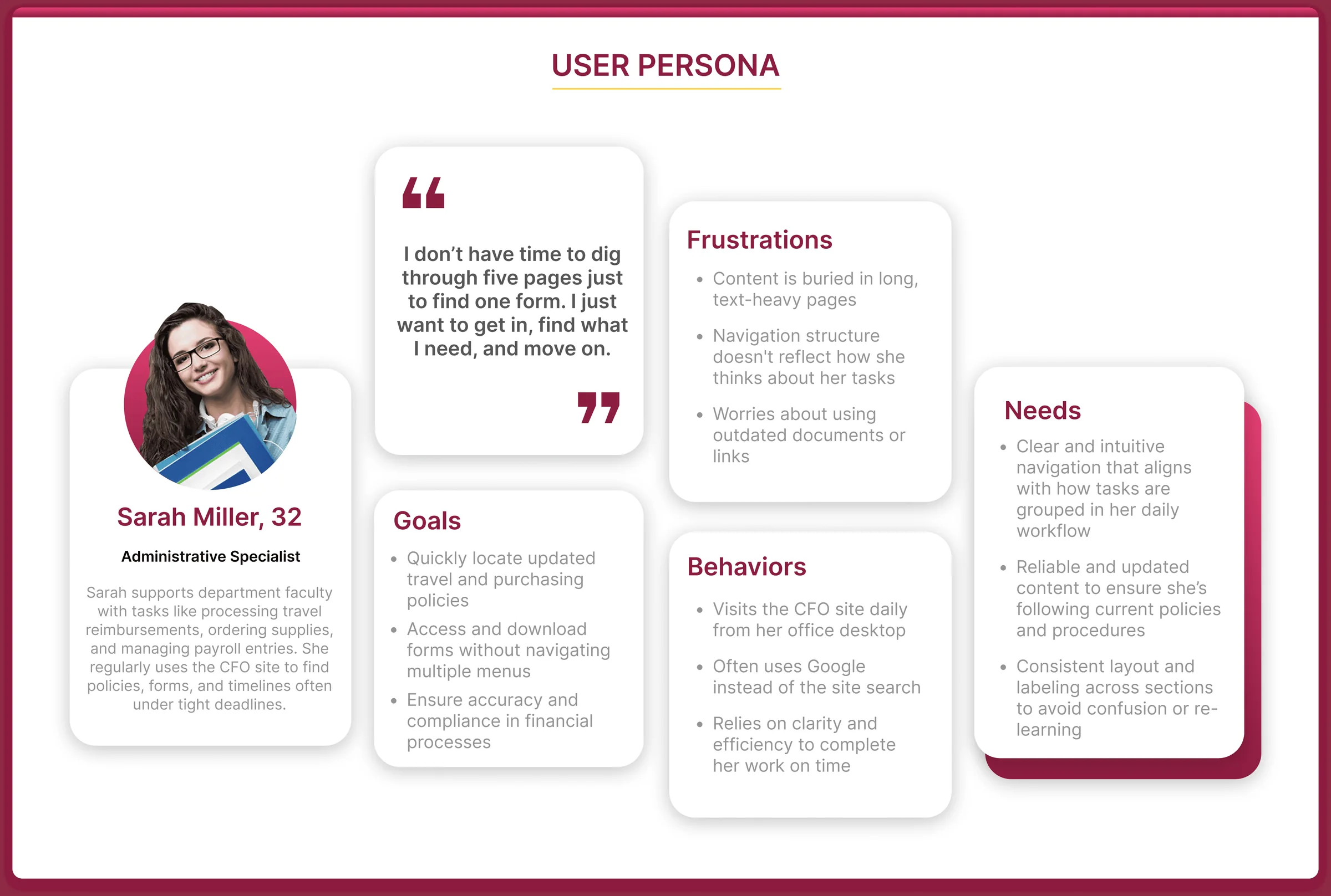
User persona
03 · Themes & insights
Everything we heard came down to three themes
I grouped the findings on an affinity board. Three clusters kept coming back.
- 1.Lack of User Navigation
- Users were unsure if they were viewing the latest or correct information.
- Users often got lost and weren’t sure where to go next.
- 2.Inefficient Search Experience
- Users often relied on Google instead of using the site menus.
- Internal search returned broad or irrelevant results.
- 3.Outdated Visual Design
- The layout felt cluttered and visually inconsistent.
- Poor visual hierarchy made important information hard to find quickly.
04 · Strategic solution
A user-centred redesign, guided by four goals
The approach targeted the usability pain points from research while staying in line with ASU’s wider digital standards.
- Improve content findability by restructuring the site’s navigation and information architecture.
- Enhance user trust and engagement through a modern, accessible and responsive UI.
- Streamline user journeys by reducing time-to-task and unnecessary page visits.
- Align with ASU’s brand and fully comply with WCAG 2.2 accessibility standards.
05 · Medium-fidelity wireframes
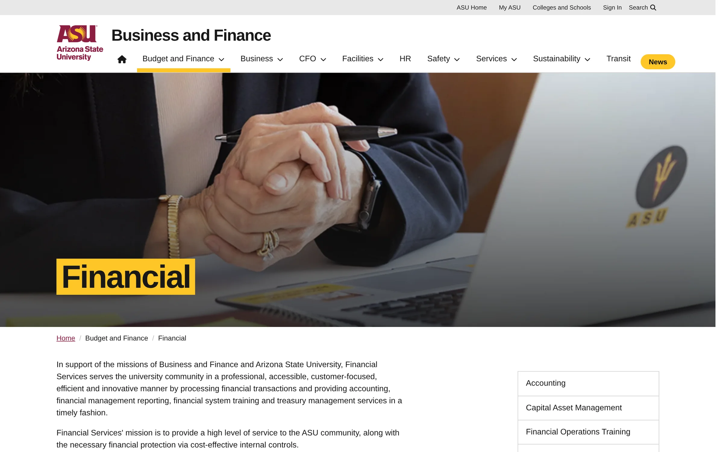
Before and after, on two of the hardest pages
I tested the medium-fidelity wireframes with 2 users to get feedback, then refined them with the content writers.
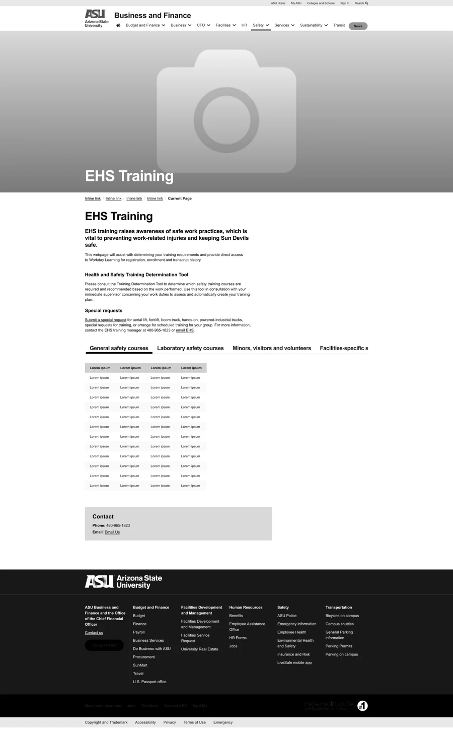
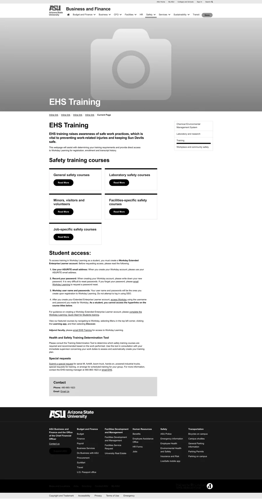
Redesigned the EHS Training page based on user support feedback. Replaced hard-to-navigate tabbed content with a clear card-based layout and action buttons, and added sidebar navigation and student access information to improve usability and discoverability.
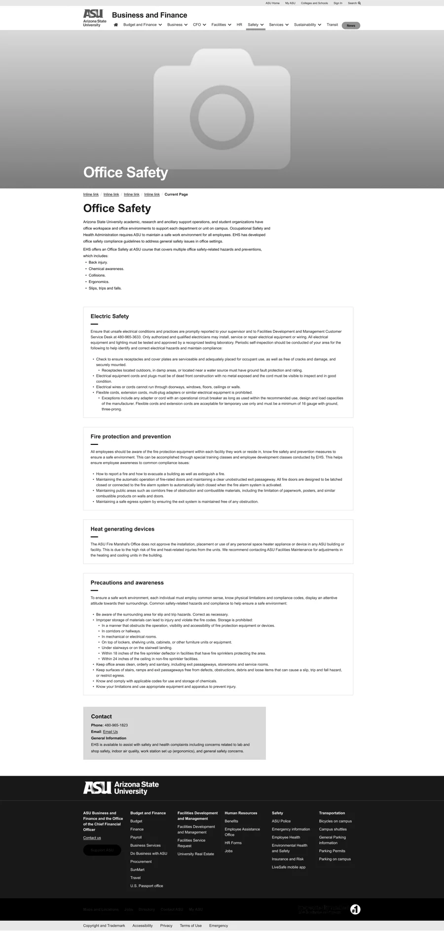
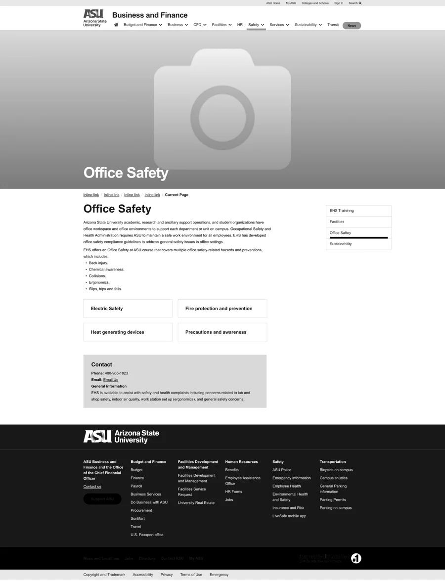
Improved page clarity and visual hierarchy by replacing cluttered, text-heavy content with a grid-based layout. Worked closely with the content writers to streamline the messaging and improve navigation.
06 · 4 primary design solutions
Four patterns that tell people where they are and where to go next
- 01Nested Sidebar Navigation
A hierarchical sidebar shows main sections with nested subpages, so people can explore related content without starting over.
- 02Breadcrumb Navigation
Keeps people oriented within the site hierarchy and cuts down on backtracking.
- 03Grid Links
Content options in a visual, evenly spaced layout, so new content is easier to scan and navigate.
- 04Card with Button
Each topic as a card with a branded call-to-action, for consistent, easy interaction.
07 · What did we achieve?
Less hunting. More finding.
After the redesigned site launched, usability, satisfaction and engagement all moved in the right direction.
- 46%increase in task success rate
- 25%increase in time spent on the website
- 48%improvement in user satisfaction score
- 30%drop in support tickets about navigation and content
- 40%reduction in average time-to-task
- 95+compliance with WCAG 2.2 accessibility standards
Figures as measured by the project team after the redesign launched.
Key learnings
- 1Start from real pain points
Understanding what people actually struggled with led to solutions that worked, not just a cleaner look.
- 2Collaboration and communication
Working side by side with the content writers and the project manager made the outcome possible.
- 3Test and refine
Refining the designs based on feedback, even from a couple of sessions, made the site more intuitive.
a calmer site, and a quieter support inbox :)
Next project
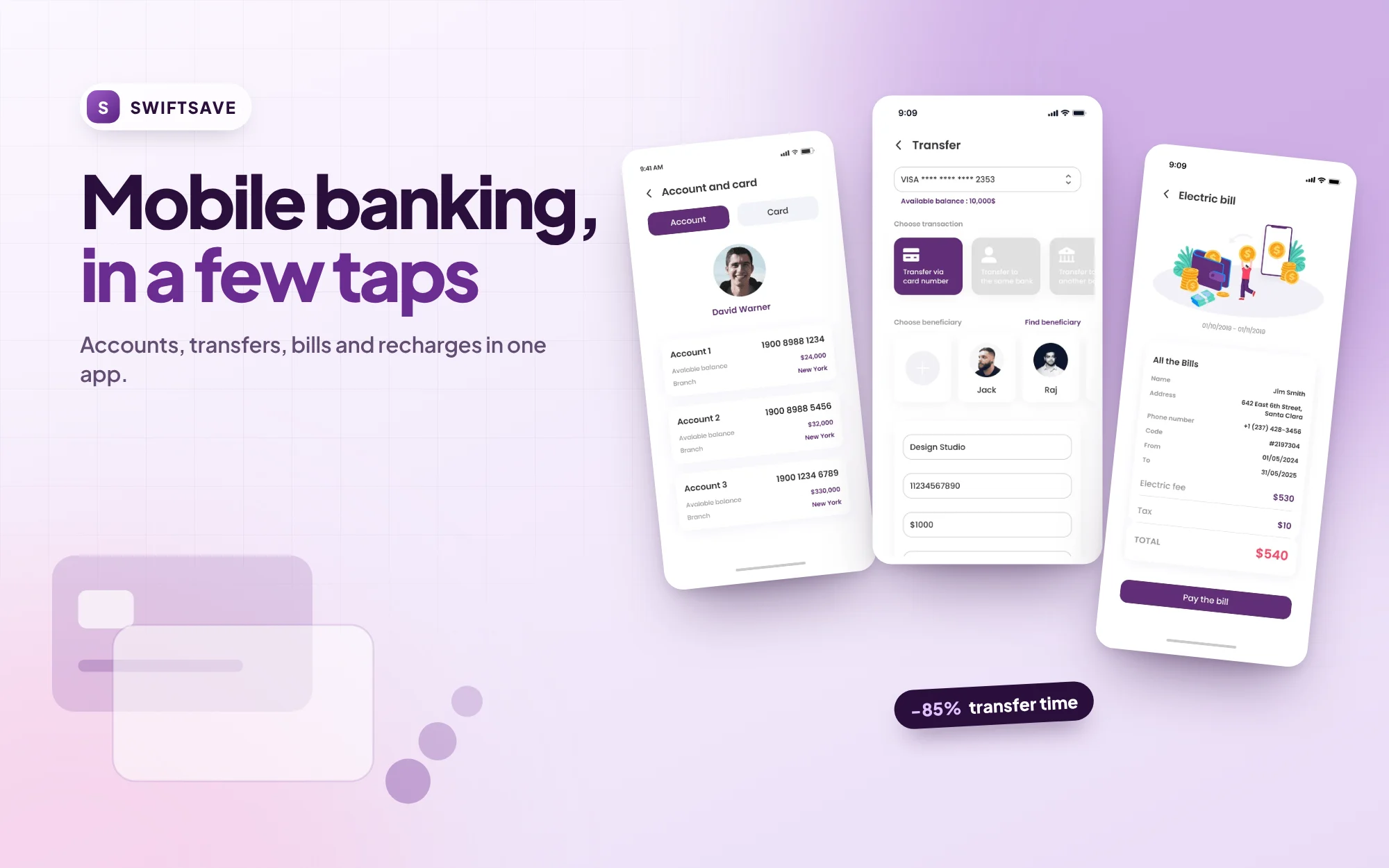 SwiftSave · Fintech · Mobile bankingDesigning SwiftSave, a banking app that turns transfers, bills and recharges into a few tapsResearch with 10 people, usability tests with 8, and eight finished flows.View case study →