
SwiftSave · Mobile banking app · Fintech
Designing SwiftSave, a banking app that turns transfers, bills and recharges into a few taps
- UX designer & researcher
- 4 months
- 10 research participants
- 8 usability tests
Overview
All your everyday banking, in one calm app
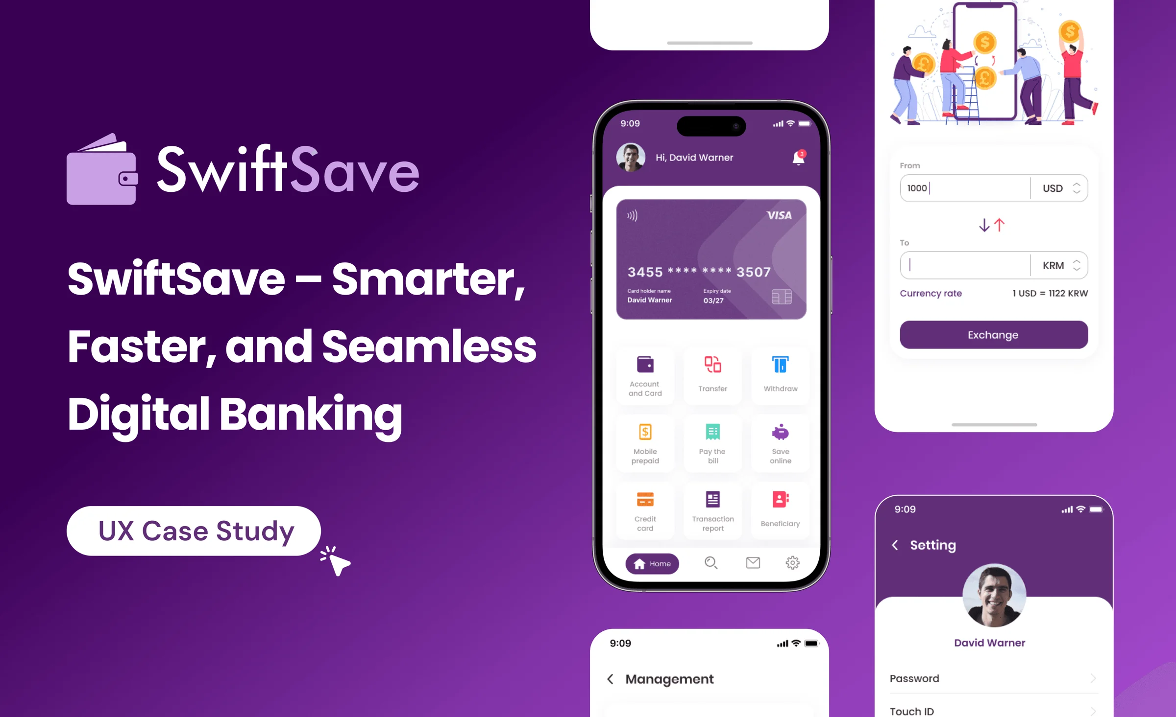
SwiftSave is an all-in-one financial app for account management, money transfers, withdrawals, bill payments and mobile recharges. People can update card details, send money, pay bills and manage beneficiaries from one place, in a secure, easy interface.
- Client
- Fintech · Mobile banking
- My role
- UX Designer & Researcher
- Timeline
- 4 months
- Tools
- FigmaZoomGoogle DocsGoogle SheetsChatGPT
How it works: key features
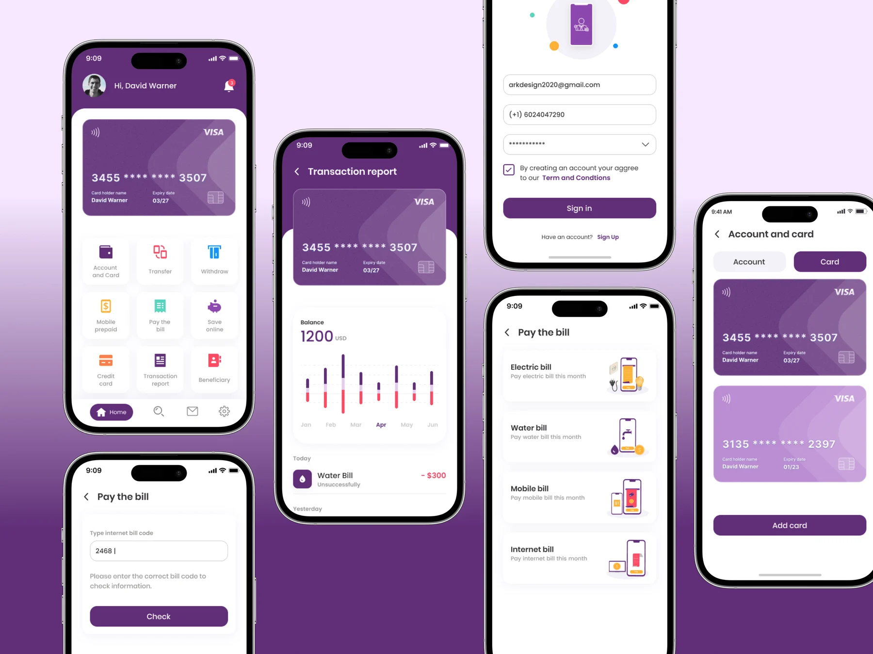
- Account and card
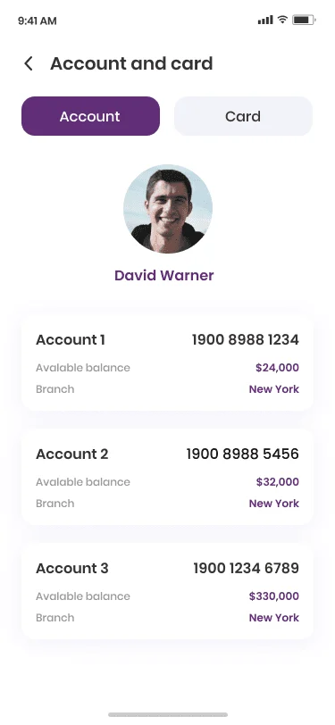
Every bank account in one place, with balance, account number and branch at a glance.
- Electricity bill
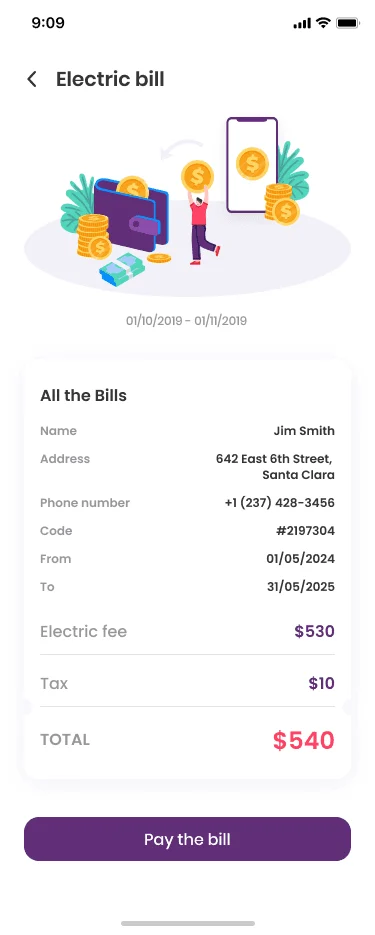
One tap on “Pay the bill” settles it, with the full breakdown right above the button.
- Internet bill
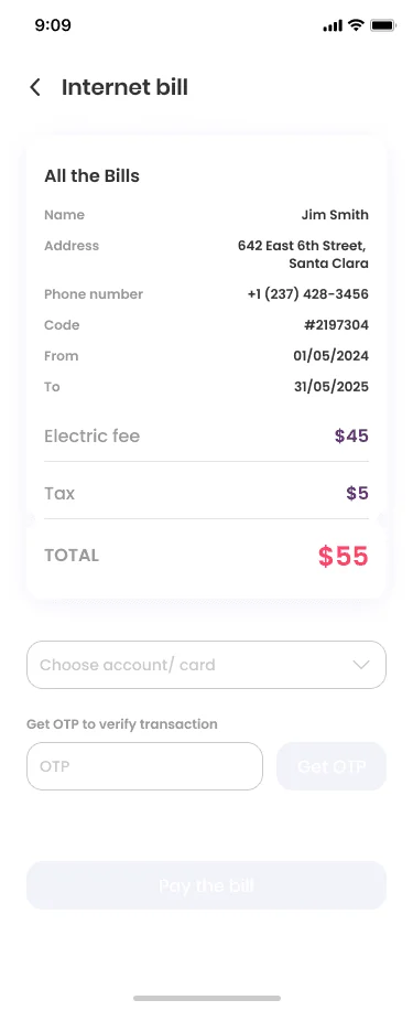
Charges, billing period and provider laid out clearly, so reviewing and paying takes seconds.
- Money transfer
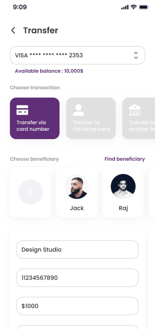
A step-by-step flow: pick the recipient, enter the amount, confirm. Done in seconds.
Phase 1 · Empathise
Traditional banking is complex and time-consuming
Basic tasks took too many steps. Moving money, withdrawing it or paying a bill often meant waiting, a branch visit or another round of verification.
- Slow transactions and payments
Transfers, withdrawals and bill payments meant delays, branch visits or repeated verification.
- No single place for accounts
Updating account details, managing cards and tracking transactions was cumbersome without one platform.
- Manual beneficiary management
Organising people you pay often was slow, which made every transfer slower and less convenient.
Where is the challenge?
Simplify banking, speed up transactions, automate beneficiary management and keep it secure, while making the whole experience better to use.
Solution
A secure, responsive fintech app that centralises accounts, automates transactions and streamlines payments: fast transfers, easy bill pay, real-time tracking and organised beneficiaries.
End users: people aged 18 to 60

Phase 2 · Define
Understanding financial needs and pain points
Research with 10 people showed where everyday banking slowed them down, and what they wanted instead.
 7 out of 10
found account management confusing and time-consuming.
 10 users
faced difficulties transferring funds or paying bills quickly.
 4 out of 10
abandoned financial tasks because the features they needed were hard to reach.
 95 seconds
average time spent navigating banking apps, with some taking up to 2.5 minutes to find basic functions.
 Every 4th user
rated their banking experience poor because of delays and inefficiencies.
Crucial insights from research
- 18 out of 10 users
wanted an all-in-one banking app for transfers and payments.
- 26 out of 10 users
found traditional bank apps overwhelming and not user-friendly.
- 33 out of 10 users
didn’t trust existing platforms because of poor UX and security concerns.
- 47 out of 10 users
felt managing beneficiaries and recurring payments was too complicated.
Who we designed for
 John Anderson38 · Director, financial services
- Talkative
- Optimistic
- Friendly
- Goal-oriented
“Managing multiple payments and tracking my expenses shouldn’t be this complicated.”
Goals
- Pay bills and credit cards quickly
- A secure, easy banking experience
- Track transactions and get timely reports
Pain points
- Banking apps that aren’t intuitive
- Slow transaction processing
- Adding beneficiaries by hand for frequent payments
Frustrations
- Poor UI makes navigation hard
- No instant transaction notifications
- Switching apps for different banking needs
Motivations
- A fast, intuitive, secure place to manage money
- Real-time tracking to stay organised
Phase 3 · Ideate
Mapping the flow before drawing a screen
Two ways in, one dashboard, and every task two steps from it.
Task Next step
Phase 4 · Design
A small design system, then the wireframes
Poppins, a purple-led palette and a shared component set came first. The mid-fidelity wireframes then set layout, structure and flow for every main task before any final visuals.
Aa Poppins
- Heading 1Semi Bold · 24/28
- Heading 2Semi Bold · 20/28
- Heading 3Semi Bold · 16/24
- Body 1Medium · 16/24
- Body 2Regular · 16/24
- Body 3Medium · 14/24
- Caption 1Semi Bold · 12/16
- Caption 2Medium · 14/16
Usability testing
Can people bank without thinking about it?
I tested how easily people could move around the app and finish core tasks: account management, money transfers and bill payments.
Participants
- Users
- 8
- Who
- Freelancers, small business owners, working professionals
- Device
- Mobile (iOS and Android)
Tasks tested
- View account balance and details
- Transfer money to a beneficiary
- Pay an electricity bill
- Add a new beneficiary
- View transaction history
Key metrics and results
| Task | Success rate | Avg. time | What they said |
|---|---|---|---|
| View account info | 100% | 12 sec | “Very easy to locate everything.” |
| Money transfer | 87% | 28 sec | “Would love auto-fill for frequent users.” |
| Pay electricity bill | 100% | 22 sec | “Felt smooth and clear.” |
| Add beneficiary | 75% | 35 sec | “Slight confusion on where to start.” |
| View transactions | 100% | 18 sec | “Quick and helpful overview.” |
Final hi-fi designs
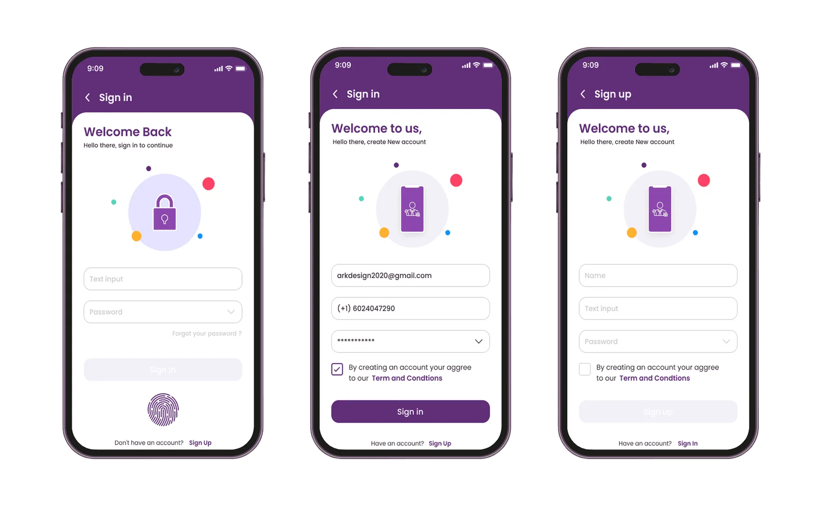
Eight flows, one consistent feel
Pick a flow, then step through its screens.
Impact
Fewer taps. Faster money.
After redesigning SwiftSave from the research and testing, I ran another usability test with real users on the improved prototype. Here’s what changed.
- −85%time to complete a money transferNow done in under 20 seconds.
- −70%time to pay a billDown to about 15 seconds.
- −75%transaction drop-offsAbandonment fell to almost zero.
- +60%user satisfactionRated 9 out of 10 for ease of use and speed.
- +35%task success rateUp to 95% task completion without help.
Measured in usability tests of the redesigned prototype, compared with the first round.
What I learned
- 1Designing for clarity builds confidence
People feel more in control when information is clearly structured. Simple UI choices did more for trust than any badge.
- 2Test early, test often
Frequent usability tests caught small issues before they became blockers, which kept both speed and quality up.
- 3User behaviour is insight gold
Watching people use the product showed patterns and needs that surveys alone never would have.
banking, minus the waiting :)
Next project
 Fortune 100 bank · AI network governanceDesigning trust into network governance, so every decision can be explainedTwelve weeks, eight users, two rounds of testing and an assistant that asks before it acts.View case study →